Building mobile browser and hybrid applications with eZ Publish
Introduction
This document focuses on creating a mobile website and extending it to be a hybrid mobile application. The mobile website is accessible via a URL. Hybrid applications access the mobile website through an app, bringing together features of both web and native applications. They are downloaded via an app store and look and feel like a native application, although they are simply displaying the mobile website. The main advantage of a hybrid application over a native application is that a consistent user experience can be enjoyed by a wider audience (via the mobile URL) while still making the most of the marketing opportunities presented by app store distribution. Changes are made on the web application end rather than requiring the user to perform the update manually via the app store.
Native applications are applications designed to work on a specific device such as an iPhone or BlackBerry. Users download these applications from an app store or through an internal enterprise program. The main advantage of native applications is that they offer access to built-in device features such as cameras or GPS functionality. Native applications often perform better than other types of apps, as they live on the device itself. These applications can also present unique marketing opportunities if they are distributed via an app store.
Pre-requisites and target population
This guideline is aimed at eZ Publish developers, partners, and integrators who need to enable a mobile web channel for new or existing eZ Publish installations. It outlines general steps required for creating a mobile browser accessible site in eZ Publish and demonstrates how to wrap it in the basic application shell. The instructions described herein assume that you have already set up eZ Publish 4.5 with the Website Interface 1.8. You should also be familiar with some basics about setting up an iOS or Android application, although anybody should be able to copy and paste the code examples to create a working application.
What do I need before I can start?
General requirements
- Web server with PHP
- Relational Database Management System
- eZ Publish 4.5 instance with Website Interface 1.8
- To build the hybrid application: a configured development environment for at least one platform: iOS or Android
eZ Publish Requirements
- OS: Linux 2.6, Windows 2008 (IIS 7 only)
- Web Server: Apache 2.2.x (prefork mode), MS IIS 7 (with Microsoft URL Rewrite Module 1.1 )
- DBMS: MySQL 5.0.x, MySQL 5.1.x, PostgreSQL 8.4, Oracle 11g
- PHP (mod_php) + PHP CLI + apache: PHP 5.2.1 -> PHP 5.2.17, PHP 5.3.x
- PHP (FastCGI) + PHP CLI + IIS: PHP 5.3.x
- Graphics handler: ImageMagick >= 6.4.x, PHP extension GD2
General guidelines for mobile web applications
- List all the features necessary for the application
- Determine who your users are and define a usage context
- Re-think and reduce the amount of content and tailor it for mobile consumption
- Design the web application for the device
- Create a dedicated eZ Publish mobile siteaccess
- Create the dedicated mobile web interface as a new design for eZ Publish
- Consider creating a hybrid mobile application as a basic shell for the mobile site
In this article, we will be covering the last 3 items on the list above.
Configuring eZ Publish and the server
Creating a subdomain is probably the most popular option for enabling users to access a mobile version of your site. Using a subdomain (such as “mobile”, or just “m” to keep it short) keeps your mobile site part of your brand without creating confusion. A subdomain gives you the flexibility to grow or scale back the mobile site without impacting the traditional website.
Note that this article does not cover mobile browser detection, for example if you want to automatically redirect mobile users to the mobile sub-domain whenever they visit the main domain. There are many different approaches to this, such as using an Apache module.
This section demonstrates how to set up a virtual host on the Apache web server for an eZ Publish installation located in "/var/www/example". Let's say that we want to access the eZ Publish mobile web channel by using the following URL: m.example.com
In order to achieve this, we need to set up both eZ Publish and the web server so that they respond correctly to different URL requests.
Apache configuration: virtual host settings
Assuming that...
- eZ Publish is located in "/var/www/example"
- the server's IP address is 128.39.140.28
- we wish to access the eZ Publish mobile web channel using the sub-domain "m.example.com"
...edit your existing virtual host configuration for your eZ Publish site at the bottom of "httpd.conf" (or in the relevant configuration file depending on your server setup):
NameVirtualHost 128.39.140.28

<VirtualHost 128.39.140.28>
    <Directory /var/www/example>
        Options FollowSymLinks
        AllowOverride None
    </Directory>

    <IfModule mod_php5.c>
        php_admin_flag safe_mode Off
        php_admin_value register_globals    0
        php_value magic_quotes_gpc  0
        php_value magic_quotes_runtime  0
        php_value allow_call_time_pass_reference 0
    </IfModule>

    DirectoryIndex index.php

    <IfModule mod_rewrite.c>
        RewriteEngine On
        RewriteRule ^api/ index_rest.php [L]
        RewriteRule ^/([^/]+/)?content/treemenu.* /index_treemenu\.php [L]
        RewriteRule ^/var/([^/]+/)?storage/images(-versioned)?/.* - [L]
        RewriteRule ^/var/([^/]+/)?cache/(texttoimage|public)/.* - [L]
        RewriteRule ^/design/[^/]+/(stylesheets|images|javascript)/.* - [L]
        RewriteRule ^/share/icons/.* - [L]
        RewriteRule ^/extension/[^/]+/design/[^/]+/(stylesheets|flash|images|lib|javascripts?)/.* - [L]
        RewriteRule ^/packages/styles/.+/(stylesheets|images|javascript)/[^/]+/.* - [L]
        RewriteRule ^/packages/styles/.+/thumbnail/.* - [L]
        RewriteRule ^/var/storage/packages/.* - [L]

        #  Makes it possible to place your favicon at the root of your
        #  eZ Publish instance. It will then be served directly.
        RewriteRule ^/favicon\.ico - [L]
        #  Uncomment the line below if you want you favicon be served from the standard design.
        #  You can customize the path to favicon.ico by replacing design/standard/images/favicon.ico
        #  by the adequate path.
        #RewriteRule ^/favicon\.ico /design/standard/images/favicon\.ico [L]
        RewriteRule ^/design/standard/images/favicon\.ico - [L]

        # Give direct access to robots.txt for use by crawlers (Google, Bing, Spammers..)
        RewriteRule ^/robots\.txt - [L]

        # Platform for Privacy Preferences Project ( P3P ) related files for Internet Explorer
        # More info here : http://en.wikipedia.org/wiki/P3p
        RewriteRule ^/w3c/p3p\.xml - [L]

        # Uncomment the following lines when using popup style debug.
        # RewriteRule ^/var/cache/debug\.html.* - [L]
        # RewriteRule ^/var/[^/]+/cache/debug\.html.* - [L]

        RewriteRule .* /index\.php
    </IfModule>

    DocumentRoot /var/www/example
    ServerName www.example.com
    ServerAlias m.example.com
</VirtualHost>
Note that we have added "m.example.com" using the "ServerAlias" directive for a server name of www.example.com.
eZ Publish configuration: siteaccess settings
A single eZ Publish installation is capable of hosting multiple sites by making use of something called the siteaccess system. This system makes it possible to use different configuration settings based on a set of rules. The rules control which group of settings should be used in a particular case. Refer to the “Site management” section of the “Concepts and basics” chapter for a detailed description of the siteaccess functionality.
eZ Publish needs to be configured to use the host access method. This can be done by manually editing the global override for the site.ini configuration file: "/settings/override/site.ini.append.php". A typical configuration would look something like this:
...
[SiteAccessSettings]
AvailableSiteAccessList[]
AvailableSiteAccessList[]=example
AvailableSiteAccessList[]=mobile
MatchOrder=host

HostMatchMapItems[]=www.example.com;example
HostMatchMapItems[]=m.example.com;mobile
...
This configuration tells eZ Publish that it should use the "example" siteaccess if a request starts with "www.example.com" and the "mobile" siteaccess if a request starts with "m.example.com".
In addition, the configuration for the “mobile” siteaccess itself must be created in the following directory: settings/siteaccess/mobile. In this directory, create a file "site.ini.append.php" with contents similar to the following:
<?php /* #?ini charset="utf-8"?

[DatabaseSettings]
DatabaseImplementation=ezmysqli
Server=localhost
Port=
User=root
Password=
Database=
Charset=
Socket=disabled

[InformationCollectionSettings]
EmailReceiver=

[Session]
SessionNamePerSiteAccess=disabled

[SiteSettings]
SiteName=Mobile Web Example
SiteURL=m.example.com
LoginPage=embedded
AdditionalLoginFormActionURL=http://m.example.com/user/login

[UserSettings]
RegistrationEmail=

[SiteAccessSettings]
RequireUserLogin=false
RelatedSiteAccessList[]
RelatedSiteAccessList[]=example
ShowHiddenNodes=false

[DesignSettings]
SiteDesign=mobile
AdditionalSiteDesignList[]
AdditionalSiteDesignList[]=ezwebin
AdditionalSiteDesignList[]=base

[RegionalSettings]
Locale=eng-GB
ContentObjectLocale=eng-GB
ShowUntranslatedObjects=disabled
SiteLanguageList[]
SiteLanguageList[]=eng-GB
TextTranslation=disabled

[FileSettings]
VarDir=var/ezwebin_site

[MailSettings]
[email protected]
EmailSender=

*/ ?>
Settings for the [DatabaseSettings] section must be properly configured per your specific setup. Note that the [DesignSettings].SiteDesign setting contains the name of the design (that we will create) that is dedicated to the mobile site.
eZ Publish configuration: permissions
Once the new siteaccess has been configured, anonymous users will need permission to view it. In order to grant the appropriate permissions, take the following steps:
- Log in to the eZ Publish Administration Interface
- Click the “User accounts” tab
- Click the “Roles and policies” link at the bottom of the left sidebar
- Click the “Edit” button for the “Anonymous” role
- Click the “Edit” button for the policy for the “user” module and “login” function
- Add the “mobile” siteaccess to the existing selection
- Click the “OK” button to return to the “Policies” list
- Click the “Save” button
Setting-up the design
When building a mobile interface, there are three key ingredients: context, information architecture, and visual design. This section focuses on visual design. It explains how to create an eZ Publish design extension, to be used by the mobile siteaccess.
Design extension
A mobile web interface design consists of HTML, stylesheets, images that are not a part of the content, and so on. Let’s look at how to create an eZ Publish design extension.
-
In the “extension” directory of eZ Publish, create the following directory structure:
mobile
| - design
| | - mobile
| | - images
| | - javascript
| | - override
| | - stylesheets
| | - templates
| - settings -
In the extension/mobile/settings directory, create a file “design.ini.append.php” with the following contents:
<?php /*
[ExtensionSettings]
DesignExtensions[]=mobile
*/ ?> -
Edit the settings/override/site.ini.append.php file to activate the extension in the [ExtensionSettings] block:
ActiveExtensions[]=mobile - Clear all the caches!
Creating a sample Hybrid Mobile Application
Now that we’ve configured the web server for a mobile-specific subdomain, and configured eZ Publish to support a mobile siteaccess and mobile design, we can start to build the design, the mobile site as a whole, and subsequently the hybrid mobile application -- one for the iOS / iPhone and one for Android phones -- as a shell for the mobile site!
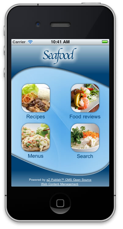
Here is a screenshot of the eventual iOS application:
Preparation
The first thing we will need is a working eZ Publish instance with the Website Interface enabled. We won’t cover the steps for how to install eZ Publish, as this process is well documented in the official documentation. Refer to the "Normal installation" section of the "Installation" chapter for more information. We also assume that you have already created a siteaccess and design extension dedicated to the mobile site, as covered earlier in this article.
Adjusting INI settings
We will be using the Website Interface design as the foundation for our mobile web channel, so we need to set the “ezwebin” design as a fallback site design in order to use its templates, styles, and so on. Verify that the configuration file settings/siteaccess/mobile/site.ini.append.php has the following settings:
[DesignSettings]
SiteDesign=mobile
AdditionalSiteDesignList[]
AdditionalSiteDesignList[]=ezwebin
AdditionalSiteDesignList[]=base
A bit later in this article, we will add a pagelayout-mobile.css file, which contains CSS styles for the main template pagelayout.tpl. In preparation for that, we will add a reference to that file in extension/mobile/settings/design.ini.append.php:
[StylesheetSettings]
FrontendCSSFileList[]=pagelayout-mobile.css
To complete our work with INI settings, we also need to copy over the Website Interface image size settings, as well as template override rules so that our mobile site can make use of much of the Website Interface foundation. Copy the following files from settings/siteaccess/ezwebin_site/ to settings/siteaccess/mobile/
- override.ini.append.php
- image.ini.append.php
Preparing templates
Next, copy the following templates from the extension/ezwebin/design/ezwebin/ folder to extension/mobile/design/mobile/. We will be modifying these templates instead of simply using them as fallback templates.
- templates/pagelayout.tpl
- templates/page_header.tpl
- templates/page_header_logo.tpl
- templates/page_head.tpl
- templates/content/search.tpl
- override/templates/full/article.tpl
- override/templates/full/folder.tpl
- override/templates/full/frontpage.tpl
Once you are done copying the files, your mobile extension’s design folder structure should look like this:
mobile
│
├── design
│   └── mobile
│       ├── images
│       ├── javascript
│       ├── override
│       │   └── templates
│       │       └── full
│       │           ├── article.tpl
│       │           ├── folder.tpl
│       │           └── frontpage.tpl
│       ├── stylesheets
│       └── templates
│           ├── content
│           │   └── search.tpl
│           ├── page_head.tpl
│           ├── page_header.tpl
│           ├── page_header_logo.tpl
│           └── pagelayout.tpl
└── settings
Here are the changes to make to the newly copied templates:
pagelayout.tpl
Make the following changes to extension/mobile/design/mobile/templates/pagelayout.tpl:
The following code change will scroll up to the device’s viewport and hide the browser navigation toolbar. Change line 29 from :
<!--[if (gt IE 8)|!(IE)]><!--><body><!--<![endif]-->
to
<!--[if (gt IE 8)|!(IE)]><!--><body onload="{literal}setTimeout(function() { window.scrollTo(0, 1) }, 100);{/literal}"><!--<![endif]-->"Line 33 should already read:
<div id="page" class="{$pagestyle}">Add to the following line ( line 34 ), which is a “div” element to which we will add a background image style later:
<div id="page-wrapper">
Line 100 should already read:
{include uri='design:page_footer.tpl'}Add to the following line ( line 101 ) to close the element added above:
</div>
page_header.tpl
Make the following changes to extension/mobile/design/mobile/templates/page_header.tpl:
Replace line 9 with the following code, for styling purposes and to add a link on all sub-pages, pointing back to the home page:
    <div class="grid">
        <div class="unit-1-4">
        {def $current_node = fetch( 'content', 'node', hash( node_id, $current_node_id ))}
        {if and( ne( $current_node_id, ezini( 'NodeSettings', 'RootNode', 'content.ini' ) ), $current_node)}
            <div id="backbutton">
                <a href="{$current_node.parent.url_alias|ezurl( 'no' ))}"><img src="{'back.png'|ezimage( 'no' )}" /></a>
            </div>
        {/if}
        {undef $current_node}
        </div>
        <div class="unit-3-4">
            {include uri='design:page_header_logo.tpl'}
        </div>
    </div>
page_header_logo.tpl
Make the following changes to extension/mobile/design/mobile/templates/page_header_logo.tpl:
Replace the contents of the entire file with the following, to simplify the code displaying the logo:
  <div id="logo">
        <a href={"/"|ezurl} title="{ezini('SiteSettings','SiteName')|wash}"><img src="{'logo.png'|ezimage( 'no' )}" alt="{ezini('SiteSettings','SiteName')|wash}" /></a>
    </div>
page_head.tpl
Make the following changes to extension/mobile/design/mobile/templates/page_head.tpl:
Add the following to line 52, in order to force the webpage into the device’s visible area:
<meta name="viewport" content="width=device-width; initial-scale=1.0; maximum-scale=1.0; minimum-scale=1.0; user-scalable=yes" />
search.tpl
Make the following changes to extension/mobile/design/mobile/templates/content/search.tpl:
Remove the following code from lines 34 - 37 (referencing the advanced search functionality, which we won’t use for the mobile site):
    {let adv_url=concat('/content/advancedsearch/',$search_text|count_chars()|gt(0)|choose('',concat('?SearchText=',$search_text|urlencode)))|ezurl}
    <label>{"For more options try the %1Advanced search%2"|i18n("design/ezwebin/content/search","The parameters are link start and end tags.",array(concat("<a href=",$adv_url,">"),"</a>"))}</label>
    {/let}
Wrap the code on lines 47 - 49 with the following “if” statement, which suppresses a simple message if the user hasn’t yet searched for anything:
     {if ne( $search_text, '')}
         <div class="warning">
             <h2>{'No results were found when searching for "%1".'|i18n("design/ezwebin/content/search",,array($search_text|wash))}</h2>
         </div>
     {/if}
article.tpl
Make the following changes to extension/mobile/design/mobile/override/templates/full/article.tpl:
Add the following code to line 3, to disable extra navigational and design elements from appearing in the pagelayout:
{set scope=global persistent_variable=hash('left_menu', false(),
                                                'extra_menu', false(),
                                                'show_path', false(),
                                                'top_menu', false())}
To have article images display in a more mobile-friendly size, change line 32 from:
{attribute_view_gui attribute=$node.data_map.image image_class=medium}to
{attribute_view_gui attribute=$node.data_map.image image_class=articleimage}Related to the reason above, change line 35 from:
<div class="caption" style="width: {$node.data_map.image.content.medium.width}px">to
<div class="caption" style="width: {$node.data_map.image.content.articleimage.width}px">folder.tpl
Make the following changes to extension/mobile/design/mobile/override/templates/full/folder.tpl:
Add the following code to line 3, to disable extra navigational and design elements from appearing in the pagelayout:
{set scope=global persistent_variable=hash('left_menu', false(),
                                                'extra_menu', false(),
                                                'show_path', false(),
                                                'top_menu', false())}
frontpage.tpl
Make the following changes to extension/mobile/design/mobile/override/templates/full/frontpage.tpl:
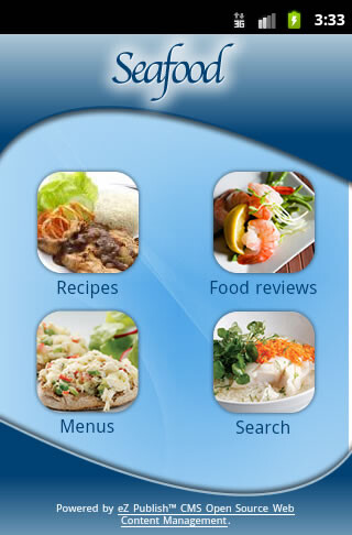
Replace the entire content of the file with the following, which disables extra navigational and design elements from appearing in the pagelayout, and sets up the basic design for the home page:
{set scope=global persistent_variable=hash('left_menu', false(),
                                           'extra_menu', false(),
                                           'show_path', false(),
                                           'top_menu', false())}
<div class="grid">
    <div class="unit-1-2">
        <div class="category">
            <a href="{'/Recipes'|ezurl( 'no' )}"><img src="{'recipes.png'|ezimage( 'no' )}" /></a>
            <h2>{'Recipes'|i18n('design/mobile/frontpage')}</h2>
        </div>
    </div>
    <div class="unit-1-2">
        <div class="category">
            <a href="{'/Food-reviews'|ezurl( 'no' )}"><img src="{'food-reviews.png'|ezimage( 'no' )}" /></a>
            <h2>{'Food reviews'|i18n('design/mobile/frontpage')}</h2>
        </div>
    </div>
</div>

<div class="grid">
    <div class="unit-1-2">
        <div class="category">
            <a href="{'/Menus'|ezurl( 'no' )}"><img src="{'menus.png'|ezimage( 'no' )}" /></a>
            <h2>{'Menus'|i18n('design/mobile/frontpage')}</h2>
        </div>
    </div>
    <div class="unit-1-2">
        <div class="category">
            <a href="{'/content/search'|ezurl( 'no' )}"><img src="{'search.png'|ezimage( 'no' )}" /></a>
            <h2>{'Search'|i18n('design/mobile/frontpage')}</h2>
        </div>
    </div>
</div>
Creating a sample Hybrid Mobile Application (continued)
Images
We have already prepared images for our mobile website, which you can download here [https://github.com/ezsystems/ezmobile/tree/master/ezpublish/extension/mobile]. Copy the following files into the extension/mobile/design/mobile/images folder:
- back.png
- bg.png
- food-review.png
- footer-bg.png
- header-bg.png
- logo.png
- menus.png
- recipes.png
- search.png
Stylesheets
In the previous steps, we have made the necessary template modifications and added images used in the mobile site design. Next, we are going to create two CSS files, one that is responsible for styling the pagelayout template and another that is responsible for styling actual content templates. Create these CSS files in extension/mobile/design/mobile/stylesheets/ as follows:
mobile
│
├── design
│   └── mobile
│       ├── images
│       ├── javascript
│       ├── override
│       │   └── templates
│       │       └── full
│       ├── stylesheets
│       │   ├── content.css
│       │   └── pagelayout-mobile.css
│       └── templates
│           ├── content
└── settings
pagelayout-mobile.css
In extension/mobile/design/mobile/stylesheets/pagelayout-mobile.css, paste the following:
body  {
    background-position: top center;
    background-image: url(../images/bg.png);
    background-repeat: repeat-y;
    color: #003F72;
}

div#page {
    width: 320px;
    background-image: url(../images/header-bg.png);
    background-repeat: no-repeat;
}

div#page-wrapper {
    background-image: url(../images/footer-bg.png);
    background-position: bottom left;
    background-repeat: no-repeat;
}

div#header {
    height: 122px;
    background-color: transparent;
    padding-bottom: 0;
    padding-top: 0;
}

div#logo {
    margin: 0;
    padding-left: 3%;
}

div#backbutton {
    padding-left: 17px;
    padding-top: 21px;
}

div#usermenu,
div#searchbox,
div#topmenu-position,
div#path {
    display: none;
}

div#footer {
    height: 80px;
    background-color: transparent;
    background-image: none;
    padding: 0;
    margin: 0;
}

div#footer address {
    padding: 5.25em 5em 0 5em;
    color: #FFF;
    font-size: 90%;
}

div#footer address a {
    color: #FFF;
}
content.css
In extension/mobile/design/mobile/stylesheets/content.css, paste the following:
div.grid {
    letter-spacing: -0.31em;
    *letter-spacing: normal;
    word-spacing: -0.43em;
}

div.unit-1-2,
div.unit-1-4,
div.unit-3-4 {
    display: inline-block;
    zoom: 1; *display: inline;
    letter-spacing: normal;
    word-spacing: normal;
    vertical-align: top;
}

div.unit-1-2 {
    width: 50%;
}

div.unit-1-4 {
    width: 25%;
}

div.unit-3-4 {
    width: 75%;
}

div.category {
    text-align: center;
}

div.category h2 {
    font-weight: normal;
    color: #003F72;
}

div.content-view-full, div.content-search, div.content-edit {
    padding: 1em 1em 2.5em 1em;
}

div.attribute-header h1 {
    color: #003F72;
    font-size: 1.8em;
}

div.content-view-line div.class-article {
    border-bottom: 1px dotted #003F72;
    margin-bottom: 0.5em;
}

div.content-view-line div.class-article h2 a {
    color: #990000;
    font-weight: normal;
}

div.content-view-line div.attribute-image {
    float: left;
    margin: 0.25em 0.25em 0 0;
}

div.content-search div.feedback h2 {
    color: #003F72;
    font-weight: normal;
}

div.content-search div.feedback {
    padding-top: 0.5em;
    border-top: 1px dotted #003F72;
    margin-bottom: 2em;
    margin-top: 1em;
}

div.content-search input.halfbox {
    border: 1px solid #003F72;
    background-color: #98CDF1;
    width: 65%;
    height: 21px;
}

input.box {
    border: 1px solid #003F72;
    background-color: #98CDF1;
    height: 21px;
}

textarea.box {
    border: 1px solid #003F72;
    background-color: #98CDF1;
}

div.content-search input.button {
    font-size: 110%;
}

div.content-view-full div.content-view-children {
    border-top: 1px dotted #003F72;
    margin-top: 0.5em;
    padding-top: 0.5em;
}

div.content-view-line div.class-comment h2 {
    font-weight: normal;
    color: #990000;
}

div.attribute-star-rating {
    display: none;
}

div.attribute-byline p.date {
    float: left;
    font-size: 80%;
    color: #006DC6;
}

div.attribute-byline p.author {
    float: right;
    font-size: 80%;
    color: #006DC6;
}

input.button, input.defaultbutton {
    color: #FFDDDD;
    border: 1px solid #990000;
    background-color: #990000;
    background-image: url(../images/button-bg.png);
    background-repeat: repeat-x;
    font-size: 85%;
    padding: 0.15em 1em;
    font-weight: normal;
    cursor: pointer;
    margin: 0.5em 0;
}

div.content-edit label {
    color: #000000;
}

div.content-edit div.attribute-header h1 {
    color: #990000;
}
Content
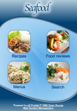
All that’s left to complete the mobile siteaccess is to populate some content. Log in to the Administration Interface and create three objects of the Folder content class, placing them beneath the root of the site. They should have the following titles: “Recipes”, “Food reviews”, and “Menus”. If you access your mobile siteaccess’ URL in a mobile browser, you should see the following:
Mobile applications
In this section, we are going to build two simple mobile applications, one for iOS / iPhone and one for the Android platform. These applications will simply be native shells for our mobile web channel. We will not cover the steps for how to set up iOS and Android development environments, as those are well documented in the official guides. Refer to the “iOS Developer Tools” or “Android SDK Installation Guide” for more information. We assume that you already have a development environment for at least one platform.
iOS application
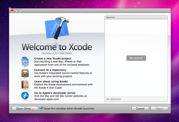
Open Xcode, and on the very first screen, select “Create a New Xcode project”. Or, select “New Project...” from the “File” menu.
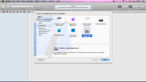
A window will appear giving you several application templates to choose from. Create a barebones Cocoa Touch application by selecting the “Window-Based Application” icon.
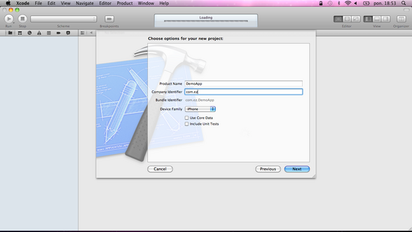
Click the “Next” button. On the next screen, type “DemoApp” for the product name, and “com.ez” for the company identifier. Select “iPhone” from the “Device Family” dropdown list and unmark the “Include Unit Tests” checkbox (as we are not going to write unit tests this time).
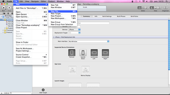
Click the “Next” button and select the location at which you want to save the project. Once the project is created, the project window will appear on your screen. Take a look at the contents of the “Project” table on the left side of the project window. In general, there are two types of files used to create an application: code and resources. Code is written in Objective-C, C, or C++. Resources are things like images and sounds that are used by the application at runtime. The groups in the project window are purely for organizing files. You can rename them to whatever you want. In the next step, we are going to create a new view controller that will be responsible for loading our web view with content served by eZ Publish. Select the “DemoApp” group on the left side and select “New -> New File...” from the “File” menu.
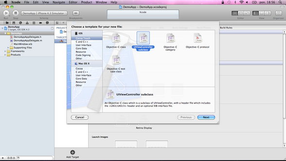
Then, select the “UIViewController” subclass from the “Cocoa Touch” group and click the “Next” button.
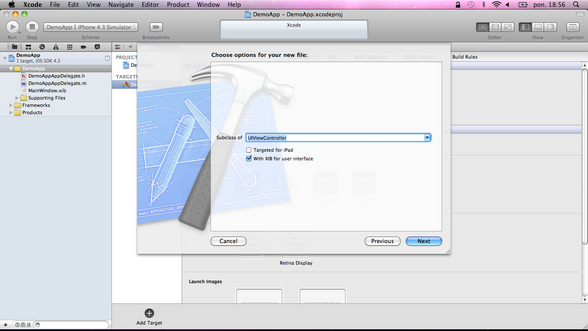
On the next screen, verify that the “Subclass of” field contains the “UIViewController” class, and that the checkbox titled “With XIB for user interface” is marked. (XIB stands for XML Interface Builder, which is covered shortly.) Then, click the “Next” button and name the file “MainController”.
Next, we need to load “MainController”, which at this point does nothing. However we will add a “UIWebView” control later, which is responsible for loading our web content. Select “DemoAppAppDelegate.h” and insert the following code:
#import "MainController.h"
Next, in “DemoAppAppDelegate.m”, create the main view controller and set it as the “rootViewController” of the window:
- (BOOL)application:(UIApplication *)application didFinishLaunchingWithOptions:(NSDictionary *)launchOptions
{
    // Create the mainController
    MainController *mainController = [[MainController alloc] init];

    // Set mainController as rootViewController of window
    [self.window setRootViewController:mainController];

    // The window retains mainController, we can release our reference
    [mainController release];

    // Show the window
    [self.window makeKeyAndVisible];

    return YES;
}
Build and run the application to verify that everything works fine. At this point, you should see only a blank white window. Next, we are going to add the web view responsible for loading the content served by eZ Publish. Because we will need to access that web subview during runtime, “MainController” needs an outlet for that subview. Add the following instance variable to “MainController.h”:
@interface MainController : UIViewController {
    IBOutlet UIWebView *webView;
}
The “IBOutlet” reference in front of the instance variable indicates that you are going to use the Interface Builder to lay out the interface for MainController’s view. When we created MainController, an XIB (XML Interface Builder) file of the same name was created and added to the project. Open MainController.xib now.
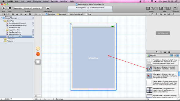
In the right pane, find the “UIWebView” control in the “Object” library and drag it into the view.
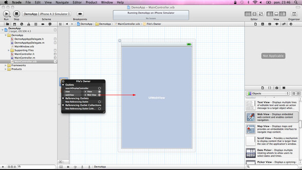
Next, make a connection from “File’s Owner” to that object, as shown below:
After a “UIViewController” loads its view, it is immediately sent the message “viewDidLoad”. Whether that view is loaded from an XIB file or using the method “loadView”, this message gets sent to the view controller. We need to do an extra initialization to a “UIViewController” -- which requires its view to already exist -- by overriding “viewDidLoad” in “MainController.m”.
- (void)viewDidLoad {

    //Create a URL object
    NSURL *url = [NSURL URLWithString:@"http://m.example.com"];

    //Request the URL
    NSURLRequest *request = [NSURLRequest requestWithURL:url];

    [webView loadRequest:request];

}
Notice that “NSURL URLWithString” takes a URL, which points to our mobile web channel available at http://m.example.com
When “MainController’s” view gets unloaded, its subviews will still be retained by “MainController”. They need to be released and set to “nil” in “viewDidUnload”. Let’s override this method in “MainController.m”:
- (void)viewDidUnload {
    [super viewDidUnload];

    [webView release];
    webView = nil;
}
Finally, we need a “dealloc” method, which frees up the object’s memory and disposes of any resources it holds, including ownership of any object instance variables:
- (void)dealloc {
    [webView release];
    [super dealloc];
}
That’s all! Build and run the application to verify that everything works fine.
Android application
Open Eclipse and select “New -> Android Project” from the “File” menu.
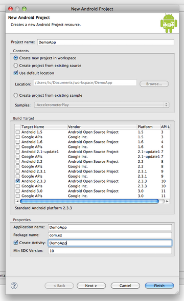
You can then enter some details for the new project. Enter “DemoApp” as the project name, select “Android 2.3.3” from the “Build Target” list, enter “DemoApp” as the application name, and enter “com.ez” as the package name. Make sure that the checkbox “Create Activity” is marked (an activity is the application’s presentation layer), enter “DemoApp” in the adjacent field, and enter “10” as the minimum SDK version. Finally, click the “Finish” button.
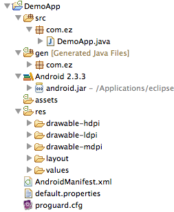
Eclipse will then create your project. You can inspect the project structure in the left panel.
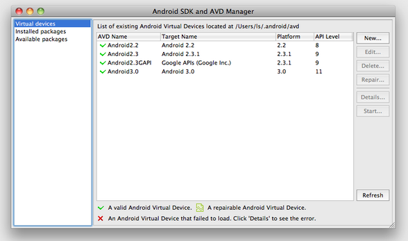
Next, select “Window -> Android SDK and AVD Manager”. In the resulting dialog, select “Virtual Devices” from the left panel and click the “New…” button.
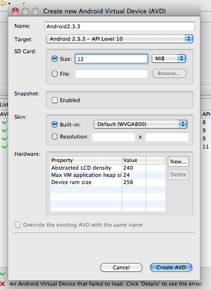
Enter a name for your device, and choose an SDK target and screen resolution. Set the SD Card size to 12MiB (this is just to specify a card size for the Android emulator).
In this example, we want to present users with our eZ Publish mobile siteaccess. The preferred method for creating the UI for our Android app is to use a layout resource file. Open the “main.xml” layout file in the res/layout project folder. Modify the main layout to include a “WebView” with a “LinearLayout”. It is important to give the “WebView” an ID, so that we can reference it later in our code.
<?xml version="1.0" encoding="utf-8"?>
<LinearLayout xmlns:android="http://schemas.android.com/apk/res/android"
    android:orientation="vertical"
    android:layout_width="fill_parent"
    android:layout_height="fill_parent"
    >
    <WebView
        android:id="@+id/webview"
        android:layout_width="fill_parent"
        android:layout_height="fill_parent"
    />
</LinearLayout>
With our user interface defined, open the “DemoApp” activity ( “DemoApp.java” ) from the project’s source folder. We will make all changes by overriding the “onCreate” method. Start by inflating your UI using “setContentView”. Then you can reference the “WebView” that was defined earlier by using findViewById().
package com.ez;

import android.app.Activity;
import android.os.Bundle;
import android.view.KeyEvent;
import android.webkit.WebView;

public class DemoApp extends Activity {
    WebView webview;

    /** Called when the activity is first created. */
    @Override
    public void onCreate(Bundle savedInstanceState) {
        super.onCreate(savedInstanceState);
        setContentView(R.layout.main);

        webview = (WebView) findViewById(R.id.webview);
        webview.setWebViewClient(new DemoAppWebViewClient());
        webview.getSettings().setJavaScriptEnabled(true);
        webview.loadUrl("http://m.example.com");
    }

    @Override
    public boolean onKeyDown(int keyCode, KeyEvent event) {
        if ((keyCode == KeyEvent.KEYCODE_BACK) && webview.canGoBack()) {
            webview.goBack();
            return true;
        }
        return super.onKeyDown(keyCode, event);
    }
}
Notice that we have loaded the URL “http://m.example.com” into the “WebView”. In addition, we defined a listener “onKeyDown” that will perform the familiar goBack() action when the device’s “Back” button is pressed.
Next, we need to create a custom class “DemoAppWebViewClient” that extends “WebViewClient” and overrides the method “shouldOverrideUrlLoading()”.
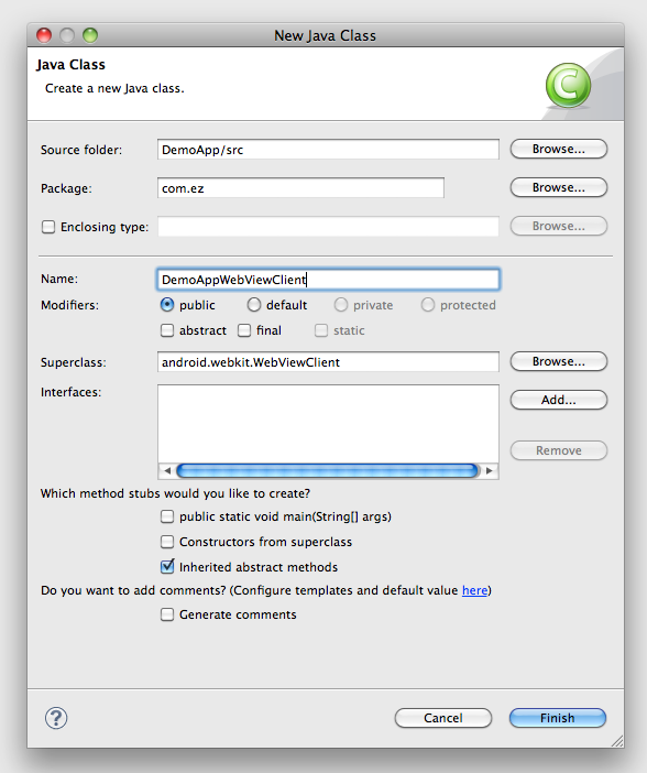
Select “New -> Class” from the “File” menu in the “src/com.ez” package. Then, enter “DemoAppWebViewClient” as the name for the class.
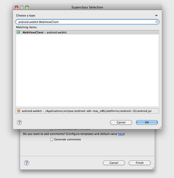
Next, click the “Browse” button to the right of the “Superclass” field. In the resulting dialog, type “android.webkit.WebViewClient”, then click OK. To complete the new class creation, click the “Finish” button.
The overridden “shouldOverrideUrlLoading()” method should be implemented as follows:
package com.ez;

import android.webkit.WebView;
import android.webkit.WebViewClient;

class DemoAppWebViewClient extends WebViewClient {
    @Override
    public boolean shouldOverrideUrlLoading(WebView view, String url) {
        view.loadUrl(url);
        return true;
    }
}
In the next step, we are going to hide the Android application title bar so that our application can work full screen. In order to do so, add the following attribute into the “DemoApp” activity in “AndroidManifest.xml”:
android:theme="@android:style/Theme.NoTitleBar"
This is what the complete “AndroidManifest.xml” file should look like:
<?xml version="1.0" encoding="utf-8"?>
<manifest xmlns:android="http://schemas.android.com/apk/res/android"
      package="com.ez"
      android:versionCode="1"
      android:versionName="1.0">
    <application android:icon="@drawable/icon" android:label="@string/app_name">
        <activity android:name=".DemoApp"
                  android:theme="@android:style/Theme.NoTitleBar"
                  android:label="@string/app_name">
            <intent-filter>
                <action android:name="android.intent.action.MAIN" />
                <category android:name="android.intent.category.LAUNCHER" />
            </intent-filter>
        </activity>
    </application>
    <uses-sdk android:minSdkVersion="9" />
    <uses-permission android:name="android.permission.INTERNET" />
</manifest>
Run or debug the application and you should see your mobile web channel in an Android application!
Resources
This tutorial is available for offline reading, in PDF format : Building mobile browser and hybrid applications with eZ Publish by Łukasz Serwatka - PDF Version
- Android Developer Center
- iOS Developer Center
- Source code examples on GitHub
- eZ Publish Sample Mobile Applications
- eZ Publish Documentation
Author
Łukasz Serwatka
Łukasz joined eZ Systems in March 2005. During his 8 years of experience with eZ Publish he created many eZ Publish based solutions and projects. He is also an author of many print and online publications about eZ Publish, as well as eZ Community supporter. He recently became a Mobile Lead Engineer at eZ Engineering, focusing on the mobile solutions dedicated to eZ Publish sharing his 2 years experience gained in the native applications development.
Reviewers
We would to particularly thank Peter Keung for his thorough review, and Nicolas Pastorino for the last review and web publishing.
License
This work is licensed under the Creative Commons – Share Alike license ( http://creativecommons.org/licenses/by-sa/3.0 ).
